How Blocks Work in @webhouse/cms
A step-by-step visual guide to the block system — from defining a block type in code to inserting it into an article and seeing it rendered on the site.
Blocks are reusable content components that you can drop into any article. Think of them as LEGO pieces: you build them once, give them a name, and then insert them anywhere with a single reference. A comparison table, a callout notice, an image carousel — all of these are blocks.
This guide walks you through the entire journey: from the code that defines a block type, to creating one in the admin, to inserting it in an article, to seeing it live on the site.
What's the difference between a block and a field?
A field is a piece of data that belongs to one document — the title of a post, the excerpt, the date. It lives inside that document and only that document.
A block is a self-contained document in its own collection that can be referenced from anywhere. One comparison table can be used in ten different articles. Edit it once, and all ten articles update automatically.
Part 1: Block types are defined in code
Before you can create a block in the admin, a developer needs to define what types of blocks exist and what fields each type has. This happens in cms.config.ts:
blocks: [
  defineBlock({
    name: "comparison",
    label: "Comparison",
    fields: [
      { name: "less", type: "array", label: "Less (left column)" },
      { name: "more", type: "array", label: "More (right column)" },
    ],
  }),
  defineBlock({
    name: "notice",
    label: "Notice / Callout",
    fields: [
      { name: "text", type: "textarea", label: "Text" },
      { name: "variant", type: "select", label: "Variant",
        options: [
          { label: "Info", value: "info" },
          { label: "Warning", value: "warning" },
          { label: "Tip", value: "tip" },
        ]
      },
    ],
  }),
]
This code tells the CMS: "A comparison block has two columns of bullet points. A notice block has a text field and a style selector."
Once this is in place, the admin UI automatically shows the right fields when you choose a block type — no extra configuration needed.
Part 2: The Blocks collection
In the admin sidebar you'll find Blocks — a collection just like Posts or Pages. Each item here is one reusable block.
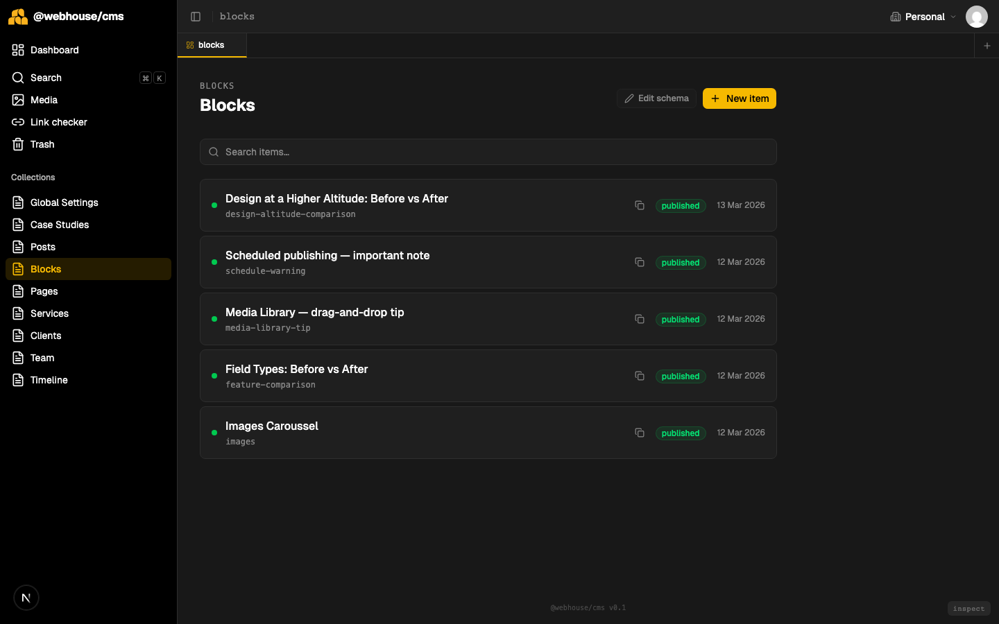
You can see all your blocks at a glance: their display name, their slug, and their publish status. The slug is what you'll use later to insert the block into an article.
Part 3: Creating a new block
Click + New item at the top right. A small dialog appears asking for a title — this becomes both the display name and the slug.
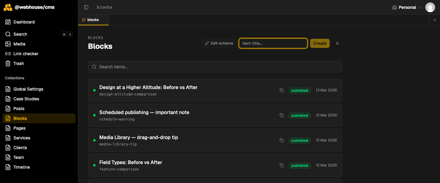
Type a descriptive name like "Design at a Higher Altitude: Before vs After" and click Create. The editor opens.
Part 4: Choosing the block type and filling in the fields
The first field you'll see is Block Type — a dropdown with all the types defined in cms.config.ts. Choose one, and the type-specific fields appear immediately below.
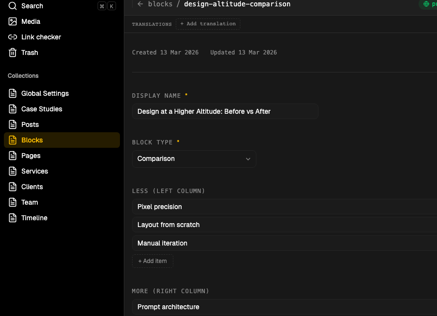
For a comparison block you'll see Less (left column) and More (right column) — each is a list of bullet points. Click + Add item to add a line, press Enter to jump to the next line, or click the × to remove one.
Fill in both columns, then hit Save and Publish.
Part 5: Inserting a block into an article
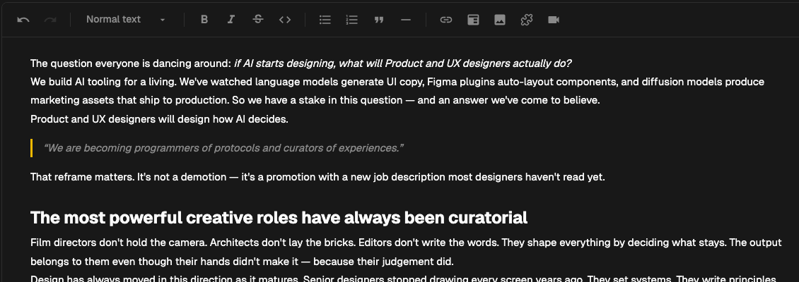
Open any post in the editor. You'll see the content toolbar at the top of the richtext field:

The puzzle piece icon (🧩, second from the right) opens a block picker. Click it, search for your block by name or slug, and select it. The editor inserts a marker like this:
«block:design-altitude-comparison»
This marker is invisible to readers — it's just a reference. The actual block content is fetched and rendered at display time.
You can place a block marker anywhere in the text — between paragraphs, after a heading, at the end of a section. It flows naturally with the surrounding content.
What it looks like on the site
When a reader opens the article, the CMS resolves the «block:slug» reference and renders the full component:
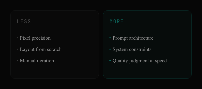
The block inherits the site's design system automatically. There's no extra styling to do — the block type's visual design is defined once by the developer, and the content editor just fills in the data.
The three block types available today
Comparison — two columns of bullet points side by side. Good for before/after, old way/new way, feature gaps.
Notice / Callout — a highlighted box with a label. Comes in three variants: Info (teal), Warning (amber), and Tip (purple). Use it for important notes, caveats, or pro tips.
Carousel — a scrollable image gallery with an optional caption. Useful for screenshot walkthroughs or product shots.
One block, many articles
The real power of blocks becomes clear when you need to update something. Say you add a fourth bullet to a comparison block that's used in three articles. You edit the block once. All three articles update instantly — no hunting through individual posts.
This is the opposite of copy-pasting content. Blocks are referenced, not duplicated. The content lives in one place, and the articles just point to it.